I’ve made many sites in HTML, with many forms, and many inputs upon those forms. I’ve made them responsively, working across many different kinds of devices. I’ve made them with many javascript additions to statisfy the aesthetic requirements and desires of the people that commisioned them. I can say that a lot of the things I designed ended up looking quite nice. But I wouldn’t say that many of the things I built out on the web felt very efficient.
However, many years ago, I worked on a system that was faster and more pleasant than any GUI input or web form that I ever encountered. And it all worked purely through text.
You would connect to this system via a terminal interface. It had a command like which let you explore this wild record-based file system that you could query in this demi-SQL language. It was fascinating, though most users did not interact with this aspect of the system. They interacted with an ancient text-based interface that was built on top of that. This interface - as ugly as many modern designers may very well likely consider it - was possibly the most efficient interface I have ever had the pleasure to use.
It put functionality behind a series of menus selectable by pressing a number key and pressing enter. The menus formed a graph that you could drill down to find a particular piece of esoteric financial accounting forms that you could interact with. Every form could be interacted with in either a “new” mode - in which you could input your form data one-by-one in an ordered fashion with a key board and an enter key to advance to the next line item you needed to enter. If you flubbed a keypress entering a number or letter where one didn’t belong it would not register the key, and you hit enter to insert an invalid value it would immediately block and invite you to correct it in a clean input box. The edit mode functioned as a mixture of the two techniques - you drilled down to a specific field with a number and the field validated as you edited it.
The effect of this interface was remarkable: everyone who was even mildly acquainted with it could navigate exactly where they needed to go and edit or add something in a near instant. Old ladies would hammer out a contract on this system with dozens and dozens of fields like a flash of lightning! And you were stuck with a certain field, you could enter ‘?’ at any time to pull up a help page for that particular piece. Your last resort if you did not know where in the menu to go to do a particular operation, was a large, comprehensive, and easy to understand manual with step-by-step instructions for virtually anything in the system you could want to do.
No mobile app or website I have ever used could hold a candle to the speed and power this simple text-based UI demonstrated. In fact, every modern application I have used has only been substantially worse in nearly every regard except the aesthetic pleasantness of the design: - To load the app takes forever. - To drill down to a place of similar complexity would take seconds to simply load the appropriate steps. - When you do find the piece of functionality you need to interact with, anything beyond one text field is comparatively agonizing to interact with even if you are using the tab key!
Now when you first use Modern AppTM it might with in some technical sense more “discoverable” in this ancient application, and the user is less liable to be confused at the first impression.
However, while the floor to use this application may in many ways be lower, so would the ceiling with encumbered by the race to satisfy the lowest common denominator; there are no old (or even young) people that interact with your app any faster than molasses.
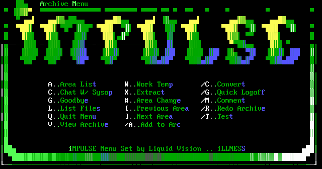
Bulletin Board Systems often had a somewhat similar interface, though on the limited bandwidth connection you usually interacted with these systems with, they weren’t necessarily very snappy, though they were pretty efficient feeling, as well as aesthetically pleasing, often decorated with beautiful pieces of ANSI art.
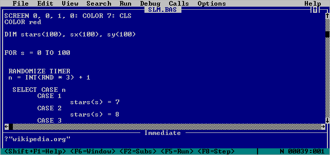
Even ignoring those sorts of applications, I remember when I was a just a young kid playing around with QuickBASIC and VisualBASIC 1. These TUIs were much closer to a “modern” GUI. You had a menu bar, and dialogs, and modals, which were all accessible through easily discoverable keymaps with common rules. Best of all, as a programming environment, was the help menu, which provided a comprehensive overview of the language, keywords, and everything that you needed to know to basically productive in BASIC. It’s no IntelliJ IDEA in many ways but it was still felt incredible at the time, and was significantly more responsive on hardware that was a fraction more powerful than my weakest computer.
I don’t mean to be an old man that says “Things just aren’t like they used to be”, but I really don’t feel like I see responsive, snappy interfaces like these anymore, and certainly not interfaces that would be accessible for the layman. Emacs, for instance, which is what I write this blogpost on. It’s extremely repsonsive. It’s cool in many ways, and I appreciate it, but I wouldn’t say that it’s anywhere near as accessible as QBasic. It’s a shame, I think, that these sorts of powers are mostly relegated to extremely niche tools. I hope that I can see more thoughtful interfaces, that don’t try too hard to handhold, which empower a regular user to use their computer effectively.
Feedback? Comment on the Fediverse from your favorite instance!!